Writing for the Web
Contents
This guide provides a step-by-step discussion of the decisions writers make as they design and develop Web sites. The guide is designed for writers—it's not intended as a replacement for the many HTML tutorials you'll find elsewhere on the Web. Instead, it focuses on the key decisions writers make to achieve their purposes and meet the needs of their readers. To learn more about writing for the Web, follow the links to the right. To learn more about the many Web design and development resources available for writers, view our Links to Design, Coding, and Graphics Resources on the Web
Planning Your Site
Planning a Web site begins with making decisions about your site's content—the words, images, and other elements you'll include on your pages. It also includes making decisions about the overall organization of your site and how you'll help your readers find their way around the site.
Planning: Create Content
Every good Web site begins with good content. Don't shortchange yourself by focusing all of your attention on site design and coding. Without content, even the best design won't hold your visitors' attention.
If you're unsure about how to write/create/generate/produce content, check out some of the resources available on the Writing@CSU Web site. You'll find several writing guides and tutorials that will help you generate content for your project.
Planning: Organize Your Site
Web sites typically use one or a combination of three organizational structures:
- linear, similar to a series of pages in a book,
- hierarchical, in which pages are linked to each other according to their level in the hierarchy, or
- interlinked, in which each page is linked to most or all of the other pages in the site.
Each organizational structure offers advantages for writers depending on their specific purposes and their readers’ needs and interests.
Linear Organization: A linear organization offers limited choices to a reader: forward and backward. A linear, or sequential, organizational pattern is similar to that found in a book or a long essay. A scientific report presented on the Web, for instance, might use a linear organization in which the title page is linked to the abstract, the abstract is linked to the introduction, the introduction is linked to the methods section, and so on. Or a book might be published on the Web with links between successive chapters.
Linear Web sites are well suited to step-by-step instructions, in which each page builds on the one that came before it. They are also well suited to documents that were originally published in print and are being republished on the Web with little or no change in content and organization.

Figure 1: An Example of a Web Site Organized in a Linear Structure
Hierarchical Organization: This organizational pattern is frequently used on the Web, particularly sites that provide categories of information, such as informative Web sites, instructional sites, government sites, and commercial sites. Like a linear structure, however, a strict hierarchy offers limited navigational choices to readers: they can move up to a higher level in the hierarchy or down to pages lower in the hierarchy. They cannot, however, move across the site to other pages that are at the same level in the hierarchy. Few sites, as a result, follow a strict hierarchical structure. Instead, they modify it through the use of navigation tools such as menus, tables of contents, and cross links—or links that move across levels or to other parts of the hierarchy.
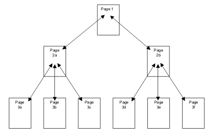
Figure 2: An Example of a Web Site Organized in a Hierarchical Structure
Interlinked Sites: In an interlinked site, it is possible to reach every other page in the Web site from a given page. This organizational structure is sometimes used in smaller sites, or in sites that use a navigational menu on each page. This organizational structure becomes difficult to support when the site grows to more than a handful of pages. In a site composed of nine pages, for instance, each page would have eight links on it. In a site composed of 100 pages, each page would need to have 99 links on it. Sites that use a predominantly interlinked organizational structure often modify it by reducing the number of links.
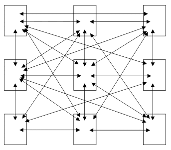
Figure 3: An Example of a Web Site Organized in an Interlinked Structure
A Combined Organizational Structure: Larger sites frequently use a mix of the three organizational structures. A site organized in a more or less hierarchical structure, for instance, might incorporate linear and interlinked structures in some parts of the site.
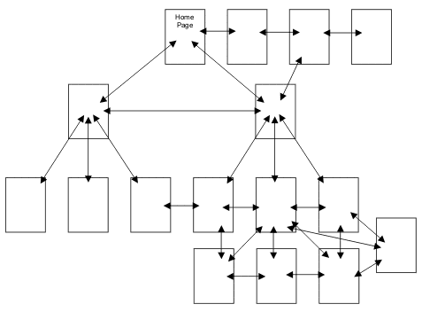
Figure 4: An Example of a Web Site Organized in a Combined Structure
Planning: Assign Content to Your Pages
Once you've chosen an organizational structure, decide what you'll put on each page. Most Web sites have a home page, or the page that serves as the main entrance to the site. Depending on the size and complexity of your site, you might also choose to create main pages for categories of information on your site. Once you've selected these pages, you can consider where the remaining information on your site should be placed.
Experienced Web designers debate whether it is best to select an organizational pattern before deciding where to place content. It's likely that you'll move back and forth between steps two and three until you've arrived at an appropriate organization and division of content on your site.
Planning: Select Navigation Tools for Your Site
Your choice of navigational tools will depend on the size and complexity of your site, your organizational structure, and your knowledge of your readers’ familiarity with the Web. At a minimum, you should provide links to and from related pages. However, there are advantages to providing additional support, including:
Persistent menus—buttons or links that appear in the same place on all of your pages—make it easier for your readers to find their way around your site because they will quickly learn where to find it on each page.
Navigation headers—a line of links running along the top of a page that mirrors the path the reader took to reach the page.
Navigation footers—a set of links running along the bottom of the page.
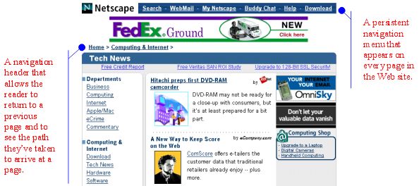
Figure 1: Examples of a Navigation Header and Persistent Menu
Tables of contents—similar to those found in print documents—can help even readers who are relatively unfamiliar with the Web.
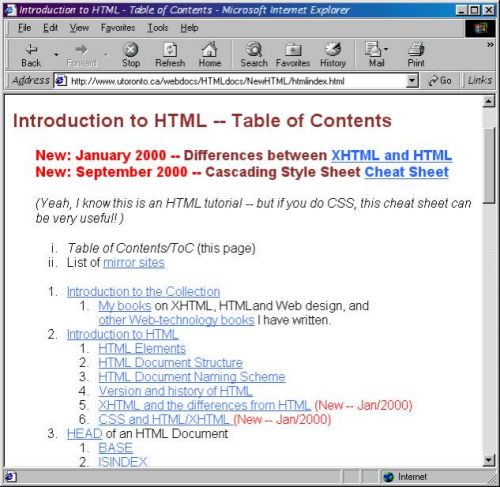
Figure 2: A Table of Contents on a Web Site that Provides an HTML Tutorial
Site maps—graphical representations of your site—are useful because many people have used road maps at some point in their lives.
Drop-down menus—which can be created using HTML forms—have the dual advantage of functioning much like the menus on word processing and other software programs, while taking up relatively little space on your page.
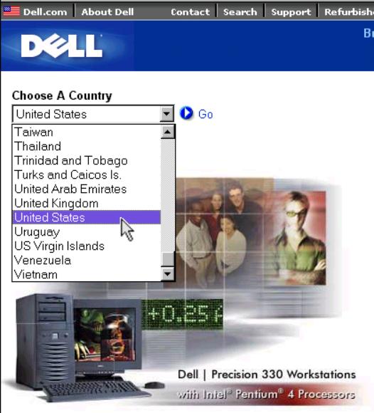
Figure 3: A Drop-Down Navigation Menu.
Designing Your Site
A Web site's design reflects the site's purpose, readers, and content. Your design decisions should address the overall look and feel of the site, how you will alert your readers to links, and what types of media elements you will include.
Designing: Review Your Content
The decisions you made as you created content for your pages and planned your site lay the foundation for the design of your site. As you begin to think more specifically about how your pages will appear—and how they will be linked to each other—review your content.
During your content review, make notes about points that you want to stage—call attention to—for your readers. Note, as well, whether specific content would be best presented in body paragraphs, in lists or tables, or via an image, an audio or video clip, or an animation.
Finally, review the placement of information in your tentative Web site structure. (Trust me—the structure you developed earlier is likely to change as you continue to work on your site.)
Designing: Consider Your Readers' Activities
After you've reviewed your content, reflect on how your readers will use your site and what they will want to gain from it. Will they, for instance, be looking for information? Will they be seeking entertainment? Will they want to learn something?
No doubt you've considered your readers' needs and interests many times before reaching this point. However, a surprising number of Web site designers seem to experience a strange disconnection as they shift from writing content to designing their sites. In the worst cases, their designs actually undermine their purpose and goals as writers and fail to address their readers' needs and interests. The designs might look great, but they don't serve either the writers or the readers.
As you consider your readers' needs and interests, take notes on how they will use your site. Then review your notes and create a prioritized list of what your readers might do on your site. Consider how you can design your site to help your readers use it most effectively.
Designing: Develop a Consistent Look and Feel
Creating a consistent design for your Web site—that is, developing a consistent "look and feel"—allows your readers to associate a particular design style with your site. This helps them become familiar with consistent placements of navigation tools, types of information, and other material that you want them to find.
Because one Web page is usually as easy to visit as another, avoid different designs on your pages. Different page designs can lead readers to think they've left your site and jumped to another. If you need to differentiate among your pages, use subtle variations in an overall design, such as differences in color, navigation aids, or placement of text on a page. Differences in your page designs should reflect differences in the function of each page.
Keep the following principles in mind as you design your site:
- Simple is better. Less is more. Don't try to cram too much on a single page.
- Keep important information on the screen. Readers often jump to another Web page if they don't find what they're looking for on the screen. Although it's relatively easy to scroll down a page, few readers are willing to scroll down more than one screen to find the information they're seeking.
- Avoid overuse of graphics. Graphics increase load time—or the time it takes for a browser to open a Web page. A well designed home page usually contains less than 40K of text and images. (To test the size of your home page, view the details of the HTML and image files used for the page. In Windows, use My Computer or Windows Explorer to view file sizes. On a Macintosh, view files in a folder.) In addition, research suggests that readers of Web pages are drawn to textual information as opposed to graphical information—a behavior that is strikingly different from readers' typical behaviors with print documents. Perhaps because so many Web sites use images largely as decoration, rather than as sources of information in and of themselves (for example, news photographs, diagrams, and charts), readers typically look first at text on a Web page.
As you begin to design your pages, browse the Web for sites that attempt to accomplish a purpose similar to your own. Evaluate their page designs, making note of features and layouts that you might want to incorporate into your own site. Then, begin sketching designs on paper or in a graphics program. When you're satisfied with your design, get ready to code your pages.
Related Pages: Learn more about Web design in the Web Style and Design Guidelines links section. Learn more about Web graphics in the Web Graphics links section.
Designing: Create a Style Guide
After you've considered the elements that contribute to the design of your Web site, keep track of your design decisions by creating a style guide. Your style guide can be simple—a set of notes and sketches. Or it can be obsessively complex. Regardless of its complexity, it can help you remember the decisions you've made about the appearance and layout of your Web pages.
Related Links: Learn more about Web design in the Web Style and Design Guidelines links section.
Designing: Create a Style Sheet
On a Web site, a style sheet puts into effect the decisions you've made about the look and feel of your site. Web sites use Cascading Style Sheets (CSS) to specify the format, placement, and (in some cases) the behavior of text, images, and other elements on a Web page. The purpose of a style sheet is to simplify the coding of your pages. A style sheet, for instance, can define the font face, size, and color of the text in a paragraph, as well as the indentation, alignment, and line spacing of the text. By using a style sheet, you can avoid coding each paragraph individually. You can also make changes that affect multiple paragraphs by changing the paragraph definition in your style sheet.
Related Links: Learn more about Cascading Style Sheets n the Cascading Style Sheets links section.
Designing: Consider Your Links
The ability to move from one document to another is the defining feature of the World Wide Web. As a designer, keep in mind that you are not limited to a sequential ordering of text. You can create complex documents (see Organize Your Site) in which the "next page" differs according to a particular reader's needs and interests. As you consider the use of links in your Web site, keep in mind the need to anticipate the options your readers are most likely to choose. If you want them to follow a particular path through your site (that is, to follow a specific sequence of pages), consider how you can use links to define that path.
Related Links: Learn more about Web design in the Web Style and Design Guidelines links section.
Designing: Consider Informational Flags
In many cases, you don't need to click on a link to learn something. Simply moving your mouse over some links and images can cause an informational flag to appear. This can help your readers decide whether they want to click on a particular link—in effect, giving them a preview of what they might find if they did click on it. Even better, it is relatively easy to create informational flags. In a word processor, such as Microsoft Word, you can create flags when you create or edit links. In a Web editor, such as Dreamweaver, you can add flags to images or links with a "title."

Figure 1: An informational flag that appears when moving a mouse cursor over a link. Try this yourself by moving your mouse cursor over the table of contents on the left side of this page.
Related Links: Learn more about Web design in the Web Style and Design Guidelines links section.
Designing: Consider Multimedia
Web sites allow you to include a wider range of illustrations, including audio files, video files, and animations, than you can include in print documents. Your use of these illustrations, however, can be complicated by factors such as the speed with which your readers will access your site, the capabilities of your readers' computers, and the possibility that animations might distract your readers' from the information you want them to review.
As you design your Web site, weigh the potential benefits of using multimedia against these concerns. If you decide to use multimedia illustrations in your Web site, but are concerned it might place a burden on your readers, consider making use of the illustrations optional—and consider providing alternative ways of presenting the information found in the multimedia illustration. For instance, in addition to providing a video file of a speech or discussion, provide a text transcription.
Designing: Design Page Elements
An important part of the overall look and feel of your Web site is the appearance and placement of specific elements on your pages. Some of the most common elements that are displayed on Web pages are described below.
- Headings display titles and subtitles on a page and are typically fairly brief. Sans-serif fonts (such as Arial, Helvetica, or Verdana) are often used to display headings. Using Cascading Style Sheets, you can control the font face, font style, font effects, alignment, size, and color of your headings. You can also control the appearance of headings using individual style definitions within an HTML tag.
- Body Text is used to display ordinary text, such as the text found in paragraphs. Typically, serif fonts (such as Schoolbook, New York, or Times New Roman) are used to display body text. You can control the appearance of paragraph text using a Cascading Style Sheet or individual style definitions within the paragraph tag.
- Images and other Multimedia Elements are commonly found on Web sites and include icons, buttons, images, animations, audio files, and video files. The appearance and behavior of these items can often be controlled by the HTML tags used to display them. For instance, images can have borders, descriptive titles (informational flags), and various horizontal and vertical alignments.
- Page Backgrounds can range from a simple white background to a repeating (tiled) image to a single image that acts as a watermark. Your design decisions should take into account the impact of a background color or image on text legibility and the emotional tones that the color or image conveys. You can control the background of pages using a Cascading Style Sheet or the the style="color: olive; ">background attribute within the tag.
- Links to other Web sites, to other parts of a document, and to other Internet resources should be clearly distinguishable from other text on the page. You can control the appearance of links on your pages using Cascading Style Sheets, individual style specifications within a tag, and link attributes within the tag.
- Navigation Aids should be displayed on your pages in a consistent manner. Avoid changing the background color or shifting the location, for instance, of a navigation menu. Consistently displaying navigation aids will make it easier for your readers to locate these tools.
Related Pages: Learn more about Web design in the Web Style and Design Guidelines links section. Learn more about Web graphics on the Web Graphics links section.
Designing: Design Your Pages
After you've considered the overall look and feel of your site, sketch out the designs for the most common types of pages you'll use on your site. Web sites can include the following types of pages:
- Home Page: provides the entry point for your site
- Contact Information Page: allows your readers to get in touch with you and others associated with the site
- About This Site Page: provides credits for the site creator(s), media providers, and writers, as well as funding and sponsorship information (if applicable)
- Main Section Pages: provide an introduction to sections of the site
- Content Pages: provide content related to particular sections of the site
- Navigation Pages: display navigation tools such as site maps, tables of contents, and site indexes
- Related Links Page: displays a list of Web sites and other Internet resources that might be of interest to your readers
Your decision about whether to use some or all of these types of pages depends on your purpose and goals as a writer as well as your readers' needs and interests.
One of the best ways to start designing the pages on your Web site is to sketch them out on a piece of paper or in a graphics editing program, such as Adobe Photoshop or Corel PhotoPaint. For example, the following sketch was made before I designed my own home page:
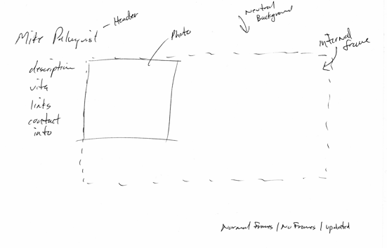
Once you've sketched out the designs for your pages, ask yourself whether they conform to your decisions about the overall look and feel of your site. If they don't, consider redefining your look and feel—or revise your pages to conform to your decisions about how the site should appear to your readers. Ask yourself whether your page designs provide access to the navigation tools you've decided to use, and whether your readers will be able to move easily among your pages using those tools.
Once you've decided that your sketches will provide a good foundation for designing your pages, decide how you'll control the layout of your pages. Depending on the complexity of your pages, you can choose from three general layout control options:
- Headings, paragraphs, and line breaks will support fairly simple designs.
- Tables can support even the most complex designs. If you are using a Word processing program or a Web editor to create your pages, tables can be fairly easy to use. If you are coding your pages, tables can make the task of creating your pages more complex.
- Cascading Style Sheets can also support complex designs, and they are more commonly used than tables to control layout. However, if you are using a word processor to define your layout, you'll find it easier to use tables.
Consider the following example, in which a table defines the layout of an early version of my home page:
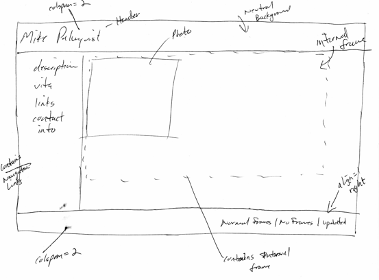
In this case, a table provided a reasonable approach to controlling the layout of text and images on the home page. Most relatively complex sites, however, use CSS to control their layouts, largely because it provides a more effective approach to laying out Web pages. Using CSS, for instance, I could have specified the layout of the menu bar and navigation footer on my home page with far less code than I used to do so with a table.
Related Links: Learn more about Web design in the Web Style and Design Guidelines links section.
Creating Your Site
Web developers create sites using a wide range of software tools—from simple text editors to specialized Web editors such as Dreamweaver to sites such as WordPress and Wix. Although there are advantages to knowing HTML—the coding language used to create Web pages—you can actually create Web sites with one of the leading word processing programs, such as Microsoft Word. The sections below provide discussions of how to create your Web site.
- Choose Your Software Tools
- Create Web Pages
- Title Your Web Pages
- Define a Basic Layout for Your Pages
- Add Navigation Tools to Your Page Templates
- Format Text and Images
- Create Lists and Tables
- Add Media Elements
- Create Links
- Consider Adding Special Effects
Creating: Choose Your Software Tools
A critical step in creating your site is choosing the software you'll use to create your pages. You can choose from word processors such as Microsoft Word or Corel WordPerfect, Web editors such as Macromedia Dreamweaver or Microsoft FrontPage, and simple text editors such as Notepad. If you choose a word processor or a Web editor, you can create your site without knowing anything about coding. For most writers—and in particular for writers who do not know the HTML coding language—this is the best option.
Most student writers will find that Microsoft Word or WordPerfect are more than adequate for creating attractive and effective Web sites. You'll find information in this guide about using Microsoft Word to create a Web site. If you'd like, however, you can also learn how to code a Web site using HTML.
Creating: Create Your Web Pages
Create a Web page in your word processor is usually as simple as choosing the FILE > SAVE AS WEB PAGE command from the main menu. Saving a file as a Web page converts the file to the HTML coding language so that it can be viewed in a Web browser. Because most word processing programs can also read HTML files, you can use your word processor to create and edit Web pages.
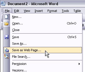
The SAVE AS WEB PAGE menu command in Microsoft Word
Creating: Add Titles to Your Web Pages
When you save a file as a Web page in Microsoft Word, you are given the option of adding a title to the page. Titles appear in the title bar of your Web browser. They also give a name to your page when someone adds your page to their bookmarks or favorites list.
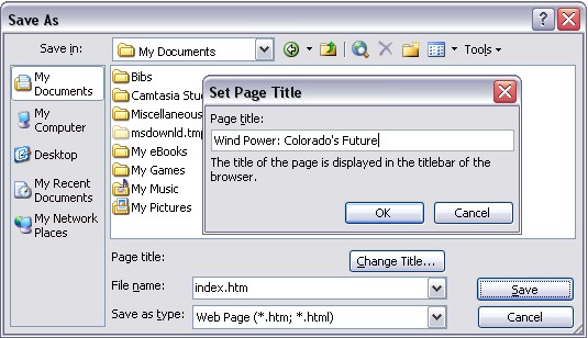
Adding a Title to a Web Page in Microsoft Word
Creating: Define a Basic Layout for Your Pages
Once you've created your first page, create a basic layout. Think about the decisions you've made about the overall look and feel of your pages and your style guide and style sheet (if you've created them). Refer to the sketches you've created as you designed your pages and decide whether you'll use a table to control the layout of your pages, or whether you'll use general formatting commands.
Pete Jacquez, a writer whose work is featured in the second edition ofThe Bedford Researcher, used a table to guide his layout of the pages he created for a Web site about wind power in Colorado. He made notes about where elements—such as images and text—would go in each cell of the table.
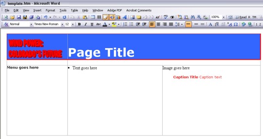
Using a Table to Define the Layout of Web Pages in Microsoft Word
Tip: Once you've set up pages that display and function to your liking, consider saving these files with a name such as pagetemplate.doc. You can open your page template and save it with a new name, filling in the content, images, and other elements. This approach allows you to create similar pages without building them from scratch. For instance, you might create a site that reviews dozens of your favorite books. Once you've decided on a particular look and feel and developed the layout for a review, create a template that you will use for all of your reviews.
Similarly, you can create layout templates for pages that introduce the main sections of your site (assuming you divide your site into sections), as well as templates for pages in those sections.
Creating: Add Navigation Tools to Your Templates
Once you've created a basic layout template for your Web pages, add the navigation tools—for instance, a side navigation menu and a link back to your home page—you've decided to use on your site. In the example below, Pete Jacquez has made the site logo (in the upper left-hand corner of the page) a link back to the home page. He's also added a navigation menu.
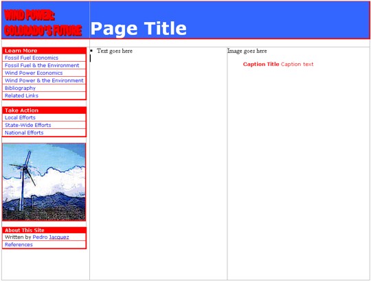
A Web Page Template with Navigation Tools
Creating: Format Text and Images
Once you've created a basic layout template for your Web pages, you can begin to add content—text, images, and so on—to your site.

A Web Page with Formatted Text and an Image
Creating: Create Lists and Tables
In many cases, lists and tables can enhance the readability of a document. You can use numbered and bulleted lists to present a series of information. You can use tables to show relationships among ideas and information. In addition, a well designed table can reduce the amount of space required to convey complex ideas and information. Tables are also useful for conveying numerical or categorical information. In the page shown below, Pete Jacquez has used a bulleted list and a table.
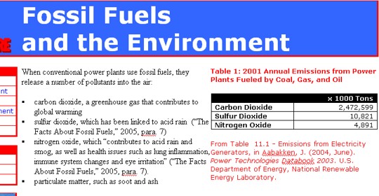
A Web Page with a Bulleted List and a Table
Creating: Add Media Elements
Web sites allow you to use a wider range of media elements than print documents. You can insert a sound file or video clip into your Web page, for example. You can even add links to spreadsheets or Powerpoint presentations. Although the size (in kilobytes—and often in megabytes) of some media files works against including them in your site, they can prove to be far more effective than a static image or a text-based description.
Creating: Create Links
When you're satisfied with the layout and content of your pages, create your links. To create and edit links in Microsoft Word, use these techniques:
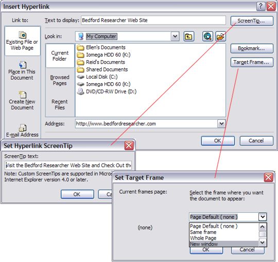
Creating and Formatting New Links: Select the text or object (picture, text box, graphic object) that you want to link and then choose the INSERT > HYPERLINK command from the main menu or the Insert Hyperlink icon on the toolbar ![]() . The Insert Hyperlink dialog allows you to select a destination (a file or a Web location) from the dialog box or type a URL in the Address field. You can also create informational flags (which appear when a mouse cursor is hovered over a link) by clicking on the Screen Tip button. The Target Frame button allows you to choose whether to open the document in the current window or a new window. Other options, such as linking within the document or creating a link to an email address, are also available.
. The Insert Hyperlink dialog allows you to select a destination (a file or a Web location) from the dialog box or type a URL in the Address field. You can also create informational flags (which appear when a mouse cursor is hovered over a link) by clicking on the Screen Tip button. The Target Frame button allows you to choose whether to open the document in the current window or a new window. Other options, such as linking within the document or creating a link to an email address, are also available.
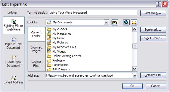
Formatting Existing Links: To format an existing hyperlink, right click (in Windows) or control click (on the Macintosh) on the link and select the Edit Hyperlink command. The Edit Hyperlink dialog, which is similar in appearance to the Insert Hyperlink dialog box, will appear, allowing you to format the link.
Creating: Consider Adding Special Effects to Your Pages
Interactivity is one of the most important differences between print and online documents. Unfortunately, many Web site designers use interactivity not because it will help them achieve their purpose and goals as writers or help them address their readers' needs and interests—but simply because they can.
Admittedly, it can be "cool" to have a sparkling star moving randomly across your pages—and it can be entertaining (to you if to no one else) to add a musical score to your site. Think twice, however, when the urge to embellish your pages strikes. If an effect will make your site more effective, use it. Otherwise, pass it by.
That said, I've added interactive effects to many of my sites, most often through Javascripts but occasionally through Cascading Style Sheets. In general, I've used Cascading Style Sheets to create understated effects such as changing the color of a link when a reader moves the mouse cursor over a link. I've also used Javascript to control the creation of new browser windows, to swap images in button bars when the mouse cursor moves over them, and to create form-based navigation menus. These effects enhance the usability of a site by providing feedback to the reader, by reducing the space needed to display navigation tools, and by providing additional control over my use of links.
Putting Your Site Online
Once your pages have been created, you can put your site online. You'll need access to a Web server (typically through your school or a Web services provider such as MSN). In some cases, you'll need software that will allow you to copy your pages from your computer to the Web server. It's possible, as well, that you'll need to set permissions on your Web pages so that readers can view them.
Going Online: Obtain a Web Site Account
A Web site account provides you with a URL (Web address) for your site, a folder in which to place your files, and a user name and password so that you can access that folder. Many colleges and universities provide Web accounts to students at no cost. In addition, some companies provide Web and email accounts for no charge.
If you are a student, you can usually learn whether your college or university provides free or low-cost Web accounts by visiting your institution's main Web site. If you are not a student, or prefer to set up a Web site that is not hosted by your college or university, consider visiting Yahoo!'s list of Web Hosting Providers. You will find a list of free Web site providers near the top of the page.
Going Online: Transfer Files to Your Web Server
Most Web site designers code their documents on their computers and then send the files to their Web sites. This process is called transferring files and is carried out using a program, such as FileZilla (http://filezilla.sourceforge.net), for Windows, and Transmit (http://www.panic.com/transmit/), for the Macintosh, that uses the File Transfer Protocol (FTP). FTP creates a connection between your computer and your Web server, allowing you to copy files in a manner similar to what you do when copying files from your hard drive to a flash drive or floppy diskette.
Your Web account provider can provide you with information about the specific procedure you should use to transfer files to and from your Web site.
Going Online: Set Permissions on Your Files and Folders
Some Web accounts are set up so that you must specify the files you want the public to view. All other files are hidden—that is, they can't be viewed using a Web browser. If your Web account uses this approach, you will need to give Web browsers "permission" to view your files. To learn how to do this, contact your Web account provider.
Testing Your Site
After you've made your site "live" (that is, after you've put your pages on your Web server), you should spend some time testing your site. Make sure each page displays properly and doesn't take too long to appear in your Web browser. In addition, make sure that all of your links work properly.
Testing: Test the Display of Each Page
Once you've set up your site so that Web browsers can view your documents, test it. Make sure:
- each page can be opened by your browser
- your text displays properly—in particular, headings, paragraphs, formatting, line breaks, and tables
- each image is placed appropriately and shows up
- informational flags appear as intended
- any audio or video files work
- any animations work
Related Links: Several Web editing programs can help you identify and solve problems with your Web pages. You can learn more about Web editors in the Web Editors links section.
Testing: Check Page Load Times
Test your pages to see how quickly they appear in your browser. Your readers will understand that the Web is a fairly slow medium. However, don't strain their patience. Your pages should load within 10 to 20 seconds—and preferably faster. If they take longer than that, consider reducing the size of any images on the page. If necessary, consider eliminating some images.
If you've included audio and video files on your Web page, test the speed at which these files open in your browser. If you can, test your files on a computer that connects to the Web at the same speed as that used by your readers. If you are connecting to the Web with a high speed connection, you might not notice that a page takes a long time to load or that audio and video files don't run well on computers that connect using modems.
Related Links: A number of Web editing programs can provide information about the size of individual pages (including all images and embedded media). Some of these programs will also estimate the load time needed for a page of a particular size. You can learn more about Web editors in the Web Editors links section.
Testing: Verify Your Links
Test your links to ensure that they work as you've intended. If you are using javascript to open your links in new browser windows, make sure the windows open properly. If you are using frames, make sure that your links open in the appropriate frames.
Related Links: If you are testing a large number of links, consider using a Web editing program such as Allaire's HomeSite+, which provides a link verification tool. You can learn more about Web editors in the Web Editors links section.
Announcing Your Site
The last set of activities related to publishing a Web site is letting your readers know it's available. In some cases, you'll simply need to send an email message with the site's URL. In other cases, you might want to add your site to the indexes compiled by leading Web search sites, such as Google, MSN Search, and Yahoo!
Announcing Your Site: Announce Your Site Via Email
Once you've created your site, share the good news. The simplest way to let others know about your site is to send them an email message with the URL (a Web address, such as http://lamar.colostate.edu/~mp) for the site. You can send an email message to individuals and mailing lists. You can also post messages to newsgroups.
Announcing Your Site: List Your Site on Leading Search Engines and Directories
If you want the widest possible audience for your site, try to get it listed on as many Web search engines and directories as possible. You can submit your site at most of the leading search sites and directories. You can also pay to have your site's URL submitted to these search engines. Check out Yahoo!'s Site Announcement and Promotion Directory for information about services that publicize your Web site.
Related Links
The links in this section provide access to resources on Web design and development issues.
Links: Good Places to Start
- Mike Markel's Web Design Tutorial
- Creating a Web Site: A Step-by-Step Guide
- How to Make a Terrible Web Site (And Why You Shouldn't)
- Beginners' Guide to HTML or, How To Make Your First Web Site
Links: Web Style and Design Guidelines
- The Yale C/AIM Web Style Guide
- Jakob Nielsen's Top Ten Mistakes in Web Design
- useit.com: Jakob Nielsen's Web site
- Web Page Design for Designers
- Web Pages that Suck
- Art and the Zen of Web Sites
- Open Directory's List of Web Style Guides
Links: Web Page Editors
- Yahoo!'s Web Editors Directory
- Open Directory's Web Editors List
- Web Editor Tools
- Free HTML Editors / Free Web Editors
Links: CSS (Cascading Style Sheets)
- W3C's Cascading Style Sheets Home Page
- W3 Schools CSS Tutorial
- Jakob Nielsen's "Effective Use of Style Sheets"
- glish.com: CSS Layout Techniques
- Zen Garden: The Beauty in CSS Design
- CSSBeauty: CSS Design Showcase
Links: JavaScript Tutorials and Resources
- W3 Schools Javascript Tutorial
- PageResource.com's Beginning JavaScript Tutorials
- JavaScript Search
- JavaScript Source
- JavaScript Kit
Links: Web Graphics
Guides and Overviews
Color
Design Examples
Image Galleries
- Open Directory's Web Graphics Directory
- Yahoo's Web Graphics Directory
- Ender Design: Realm Graphics Web Images
Links: HTML (HyperText Markup Language)
- W3 Schools HTML Tutorial
- Maricopa Community Colleges' "Writing HTML: A Tutorial for Creating Web Pages"
- HTML Primer's "HTML Tutorial and Resources"
- Yahoo's List of HTML Resources
- Hypertext Markup Language Home Page
Citation Information
Mike Palmquist. (1994-[m]DateFormat(Now(), 'yyyy')[/m]). Writing for the Web. The WAC Clearinghouse. Colorado State University. Available at https://wac.colostate.edu/repository/writing/guides-old/.
Copyright Information
Copyright © 1994-[m]DateFormat(Now(), 'yyyy')[/m] Colorado State University and/or this site's authors, developers, and contributors. Some material displayed on this site is used with permission.