| Eyepath, Hypertext, and Nonlinearity |
|
|
When we restrict our notion of linearity to textual eyepath—that
is, the movement of the reader's eye encouraged by text and page layout—it
is easy to find pre-hypertext instances of printed text that don't fit
customary ideas of print linearity. Here are four interesting examples. |
|
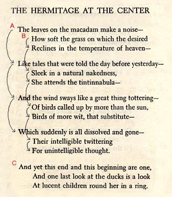
| Or consider this poem by Wallace Stevens, "Hermitage at the Center," published in 1954. The poem consists of three sentences. The first two, which start respectively at line one and line two, are interwoven so that they both conclude at the end of the fourth stanza with a shared full stop. It is possible to read the lines sequentially, with the second sentence treated as a parenthetical thought periodically taken up and set aside, but that requires a short-term memory capacity that I, for one, do not have. With arrows I have indicated the path my eye takes in reading this poem. I begin at point A, return to point B, and then regather at point C and finish. This nonlinear eyepath reflects the nonlinear movement of consciousness reenacted by the poem. The observer of the ducks ("one last look") is aware of two things at once, the fall weather and the mother duck and her ducklings, the end of summer and the beginning of a family—and then has the insight that "this end and this beginning are one." The park (probably Elizabeth Park in Hartford, Connecticut, where Stevens liked to retreat from the noise of the city) is both the locale and the symbol of a field where season, animals, and humans ("Birds of more wit") form an interpenetrating whole. The experience is a "ring" that a straight line, whose end and beginning are not one, would belie. Poems, they say, are written to be read aloud. But not all poems. Reading aloud enforces a linear path that erases the many ways poets over the ages have encouraged nonlinear readings, with refrains, interlaced rhyme and metaphor schemes, picture shapes, acrostics formed of the first letter of each line (see CompPanel 40), and many other techniques. Nonlinearity in poetry is very common. You may think the dovetailing of lines in "The Hermitage at the Center" is eccentric, but I have run across the same trick in May Swenson, Robert Creeley ("Le Fou"), Gary Snyder ("Burning"), and Pierre Reverdy ("Perspective"). |
 |
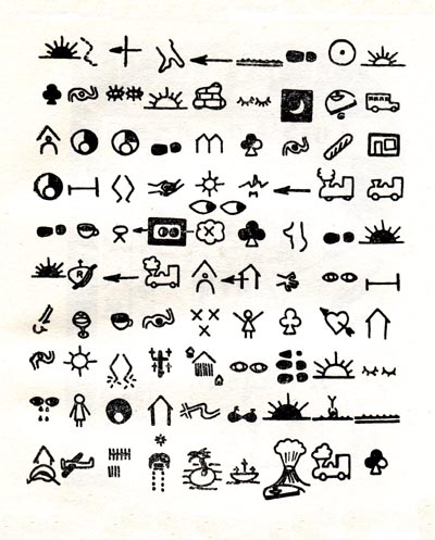
| In 1956, two years after "The Hermitage at the Center" appeared, Maurice Lemaître published one of the great curiosities of discourse theory, a 69-page tract called La plastique lettriste et hypergraphique. Lemaître was convinced that in terms of communication the arts had reached a dead end. Whether painting, sculpture, writing, film, or photography, art had exhausted its resources and for means had only "hardened symbols" (symboles scléroses, p. 23). The way out was Lettrism, or the"plasticization of hypergraphic writing" (plasticisation de l'écriture hypergraphie, p. 24). This discourse beyond current discourse, which Lemaître called hypergraphy or sur-writing (super-écriture, p. 17), would combine photography and the pictorial and plastic arts and add phonemes and other human sounds not yet utilized. Lemaître was not one to hide behind theory. He offers an example of a hypergraphic novel (roman hypergraphique). It consists of five plates and an introductory explanation (pp. 25-35). Here are plates Cand D. | |
 |
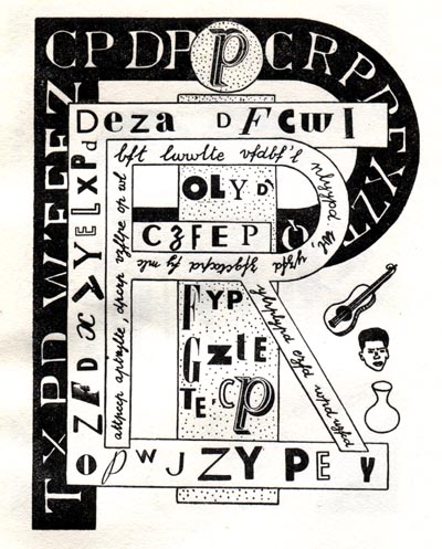 |
| Plate C, explains Lemaître, describes a trip to Italy (presumably beginning and ending in Paris). Pictures represent actions. So closed eyes signify sleeping, a full glass signifies drinking. It's up to the reader, Lemaître says, to figure out the meaning. What is also up to the reader is to figure out an eyepath. I don't think the left-to-right, top-down movement of conventional Romance-language script will work here. What I take to be the conclusion to the journey is represented by the three pictographs at the bottom left: the vertical slashes tally a journey of ten days, the airplane indicates a flight back to Paris, and the house locates his home in St. Germain-des-Prés (the kidney-shaped schematized map of the Paris district also appears in Plate A, much larger and with landmarks identified). This and other clues suggest that the reader begin at the upper right and read the lines right-to-left, as in Hebrew, Arabic, runes, and other languages. Plate D, Lemaître tells us, is a cryptogram (his only hint is that "c" equals "r"). More interesting is that the basic eye direction proceeds foreground to background (or background to foreground), as in a painting. Together the five plates of Lemaître's roman hypergraphique demonstrate five novel and nonlinear eyepaths for "reading": Plate A, spatial approaching; Plate B, inward spiral; Plate C, right-to-left; Plate D, foreground-background; Plate E, maze. Lemaître's hypergraphic anticipation of hypertext is a little eerie. | |
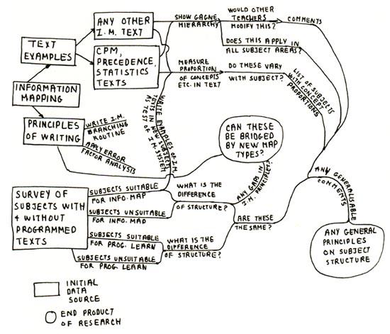 |
My last example prefigures hypertext even more clearly. This is an illustration of "pattern mapping" or "pattern notes," published by Alan Fields in 1982. Pattern notes is a method of inventional pre-writing that Fields recommends to technical writers. "Pattern notes exploit the fact that our mind jumps from point to point in a non-linear manner as we think about ideas for a topic" (p. 33). The figure shows his own pattern mapping for the summary section of a research proposal. Note that though the end text would have been written in a conventional "linear" fashion, this synopsis of the exposition is heavily recursive. In figuring out Fields' summary, the reader can begin anywhere and move in several directions. Fields' nonlinear invention technique was not radically new in 1982, of course. For decades now, issue trees, hub and spokes, writing wheels, idea clustering, topic branching, topic mapping, word associations, and many other pictorial strategies have been proposed by writing teachers to break down the kind of linear thinking that often impoverishes a topic before it is turned into a sequence of words, sentences, and paragraphs. Word by word, sentence by sentence, paragraph by paragraph may be the order that convention imposes on printed text, but, as Stevens would say, that order is a fiction since they occur there spatially and temporally all at once. It is certainly a fiction to think that readers actually process a piece of prose in that order, no matter how conventional the text. Eye-tracking studies have been active since the 1930's, and saccades, scanpaths, and fixation positions, when mapped, show that human cognitive processing is never linear though the text or picture may appear to be. The brain was hypertexted before computers were, a fact that writers have known and used for centuries. These four examples of "non-linear" discourse may be odd but they are not transgressive of "conventional" modes of discourse. Yet the myth that hypertext radically breaks linear print persists. In 2002, virtually all of Jean Mason's informants proposed "non-linearity" as the one element that most differentiates hypertext from printed text. Significantly, Mason's point is made in an e-book, whose index, with multiple entry points and many interconnections, is remarkably similar to Fields' pattern notes.
|
References:
RH, July 2006 |
|
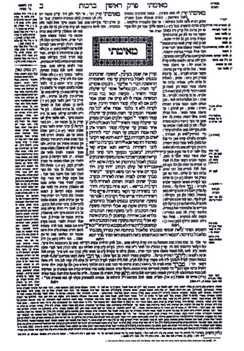 Early
appraisals of hypertext, captivated by what seemed a radical new communication
technology, stressed its break with the "linearity" of print.
In 1991, for instance, Paul Delaney and George P. Landow defined hypertext
as "the use of computers to transcend the linear, bounded and fixed
qualities of the traditional written text" (p. 3) [sources below].
It was not long, however, before this neat break between print text
and hypertext was questioned. It was pointed out that discourse linearity,
even print linearity, operates in more than one way (Luciano Floridi,
1999) and that nonlinearity can refer to any one of many reading possibilities,
some present in "traditional" print text, such as the arbitrary
sequencing and ready access of script parts (Espen Aarseth, 1994).