Engineering Technical Reports
Technical reports include various types of "technical" information. For example, if you need to report why a design or piece of equipment failed, you'd write a forensic report. Or, you might have to write about a design you created. Then, you'd produce a design report or, you may need to combine these two. Many report types are classified as technical reports. You should always determine what information you need to convey and who your audience is before you start writing.
Technical reports present facts and conclusions about your designs and other projects. Typically, a technical report includes research about technical concepts as well as graphical depictions of designs and data. A technical report also follows a strict organization. This way, when other engineers read what you write, they can quickly locate the information that interests them the most.
Audience
As a student, you might assume that your technical report's audience is your instructor, however, this may not always be the case. Your instructor may ask you to produce a report for your peers or for other engineers. However, you shouldn't always assume that your audience has a strong engineering background or is familiar with the engineering terminology you use. Always check with your instructor to know who your audience is.
As an engineer in the field, the most likely audience for the technical reports you produce is other engineers with a background similar to yours. This audience is more likely to understand the terminology you use. However, you should always evaluate who your readers will be before assuming they will understand your jargon. Consider how your readers will use your report. For instance, you might submit a technical report to a publication or your technical report may present a specific design. The audiences in each situation have different needs. Audiences may read the publication for information and insight while audiences reading about your specific design may critique your design or make decisions based on its content.
General Format
Technical Reports have an organized format because a majority of your audience may not read the entire report in one reading. This specific format allows readers to quickly locate the information they need.
Most technical reports include the parts listed below. However, you may be required to include or exclude specific sections. Be sure to check with your instructor before using the format outlined here.
Transmittal Letter
Transmittal letters often accompany reports and inform readers of a report's context. Typically, the letter includes information not found in the report. For example, the letter contains information about the particular project and/or due dates. A Transmittal Letter is a business letter and should be formatted accordingly; that is, you should include the recipient's address, your address, a salutation and closing. Depending on the project, you may also need to include contact information. Always check with your instructor to determine whether or not you should attach a transmittal letter to your report.
Title Page
A technical report should always include a title clearly identifying the report. A title should be descriptive and accurate, but not wordy, verbose or too terse.
Abstract
The Abstract is extremely important because it helps readers decide what to read and what to pass over. The idea of the Abstract is to give readers an honest evaluation of the report's content, so they can quickly judge whether they should spend their valuable time reading the entire report. This section should give a true, brief description of the report's content. The most important purpose of the Abstract is to allow somebody to get a quick picture of the report's content and make a judgment.
Since an Abstract is a brief summary of your report, its length corresponds with the report's length. So, for example, if your report is eight pages long, you shouldn't use more than 150 words in the Abstract. Generally, Abstracts define the report's purpose and content.
Executive Summary
Typically, Executive Summaries are written for readers who do not have time to read the entire technical report. An executive summary is usually no longer than 10% of the report. It can be anywhere from 1-10 pages long, depending on the report's length. In the executive summary, you should summarize the key points and conclusions from your report. You might include anexecutive summary with your report, or the summary can be a separate document.
Some reports only include an abstract while others include an executive summary. Always check with your instructor to determine which to include or if you should include both.
Table of Contents
A Table of Contents includes all the headings and subheadings in your report and the page numbers where each of these begins. When you create a Table of Contents, one of the most important decisions you have to make involves design. A good Table of Contents distinguishes headings from subheadings and aligns these with the appropriate page numbers. This also means you should pay attention to capitalization, spacing, and indentation.
List of Figures & List of Tables
These two separate lists assist readers in locating your photos, drawings, tables, graphs and charts. Like the Table of Contents, you need to present both of these in an organized, appealing format. Typically, you can shorten a figure or table's title when you create these lists.
Report Body
In a technical report, the body typically presents an Introduction, various other sections, depending on your topic, and a Conclusion. Throughout the body, you should include text (both your own and research from other sources), graphics, and lists. Whenever you cite information or use graphics from another source, you must credit these sources within your text. Check with your instructor to know which reference style to use.
References
Whenever you cite information (this includes graphics) from another source, you must credit the source in your References. Always check with your instructor to determine which reference style to use.
Appendices
Appendices include information that is too large to fit within your report, yet information necessary to your report. For example, large graphics, computer print-outs, maps, or sample codes are best placed in Appendices. When making decisions about what to place in an Appendix, consider whether or not the material interrupts the reading flow. For instance, six pages of calculations would obviously cause readers to loose their train of thought. Appendices always appear at the end of a report.
Example Technical Report
As you read the example, keep in mind that this technical report was a requirement for CE208 at Colorado State University. The course instructor, Dr. Tom Siller, commented on this document. Other instructors or job situations may have different opinions or require a different format.
Transmittal Letter
December 12, 1996
Dr. Tom Siller
Colorado State University
Fort Collins, CO 80524
Dear Mr. Siller:
We are submitting to you the report, due December 13, 1996, that you requested. The report is entitled CSU Performing Arts Center. The purpose of the report is to inform you of our design decisions for the center. The content of this report concentrates on the structural and acoustical aspects of the CSU Performing Arts Center. This report also discusses cable-stayed technology. If you should have any questions concerning our project and paper please feel free to contact Mike Bridge at 491-5048.
Sincerely,
Mike Bridge
Lead Engineer
Instructor Comments
This is not a very good business letter. In a business letter, you typically present your own address in addition to the receiver's address. Also, my address is incomplete. They need to include "Department of Civil Engineering." And what about a logo? Letterhead? Typically, businesses have letterhead.
Another problem is that the contact phone number is buried in the text. This makes it easy to miss. A good idea is to list the contact phone number under your title at the bottom.
This letter should also provide a context for the project, "This final project was completed for CE 208…" In other words, this project represents your last say; no more is coming.
Title Page
Fort Collins, Colorado
Group 9
Project Engineers: Mike Bridge
Alice Lake
Simon Civil
Karen Nuclear
Instructor Comments
The title page here is missing key information. There should be date and client name (That'd be me!). A client in this environment is the class. For instance, you might say, "submitted for" or "to," something of that nature.
The format looks good. I like the use of bold in spots. It highlights the text.
It's also good that they identified themselves with the group.
Abstract
Abstract
MASK Engineering has designed a performing arts center for the CSU campus in order to provide a complex that will better serve the campus and the community. This facility will not only improve the performing arts programs on campus, but will encourage students and community members to attend more cultural events in Fort Collins. The capacity of the new facility will exceed that of existing structures on campus, and the quality of sound and aesthetics will be improved. Some of the features included are a large performing hall, a coffee shop, a banquet hall, and a recording studio. The total area of the complex is 56,500 square feet split into three levels.
Instructor Comments
This abstract summarizes the accomplishments of the project and what it will do. It also summarizes some of the actual design and indicates that it's going to include a performing hall, coffee shop, banquet hall, and recording studio.
The writing, however, could be a little tighter in my opinion. The first sentence looks like it's around 20 words long. First of all, that whole expression "will better service the Campus and the Community" doesn't mean anything. What does "better serve" mean? And so, I look at something like that and say, "Mask Engineering has designed a new Performing Arts Center that will meet the needs of the theater community," or something more specific.
And then the second sentence is typical. It gives the particular vehicle for doing the programs. It implies the facility improves programs, and I'm not sure that's quite the right subject in a sentence like that. There's no point in a "but" here. It will do this and this; it's not a contrast. They're not contrasting anything. And so, there are some grammatical problems here. I think these kinds of grammatical problems come up because students don't read carefully. They write it. To avoid this construction, read it sentence by sentence and say, "What does this sentence accomplish for me?" And you can see that this sentence structure doesn't accomplish; it implies there's a contrast, well, there is no contrast.
Then the abstract gets stronger. "The capacity of the new facility will exceed that," so they get very specific. "The quality, sound and ascetics will be improved. Some of the features included are this." They're very good at being descriptive and saying this, this and this. The struggle I think engineering students have is the motivational lead-in to their material. They're more comfortable at the descriptive aspect of their material.
Acknowledgments
Acknowledgments
MASK Engineering would like to thank Dr. Michael Schaff of the CSU Music Department and Ms. Annie Cleveland from the CSU Theater Department for their expertise and input for the CSU Performing Arts Center. We would also like to thank Dr. Tom Siller for his aid in our research and use of his research materials.
Excecutive Summary
Introduction
Our main goal was to design a Performing Arts Center for the CSU campus that would blend well with the rest of the campus. To achieve this goal, our group split into two smaller groups; Alice in one and Simon, Mike, and Karen in the other. Alice concentrated on acoustical aspects of the complex. Simon, Mike, and Karen concentrated on the structural plans.
Location
In this section, we specify the exact location of the structure and why we believe it is a prime location.
Cable-stayed Technology
Here, we present our rationale for using cable-stayed technology. We base this technology on several other existing structures.
Main Hall Acoustics
One of the key characteristics of a concert hall that greatly influences sound quality, is its reverberation time (the time before the decay of the reflected sound ). In the construction of the main hall for the CSU Performing Arts Center a balance will be determined that will create a reverberation time of two seconds, as independent of audience size as possible.
Materials
In this section, we discuss the materials to be used. Retractable banners will be built into the ceiling, and can be lowered to create this effect. Cloth seats will be used as they best assimilate an occupied audience area ( Beranek 1962 ). This allows sound within the hall to be independent of audience size. The low sound absorbency of plaster also makes it ideal for the creation of the desired reverberation time of two seconds.
The intensity of the direct sound should not be too weak, but at the same time, it must not become uncomfortably loud. This problem will be dealt with by limiting the length of the room, and by designing the surfaces above and around the stage to project the sound evenly throughout the concert hall. Another problem arises with the seats placed under a balcony. To prevent a muddiness within the sound, the depth under the balcony should not exceed the height of the opening beneath the balcony.
The Colorado State University Performing Arts Center consists of three levels. The total area of the complex is 56,500 square feet. The basement and ground floors consist of 20,500 square feet apiece. The second floor has a square footage of 15,500.
Conclusion
During the duration of the project, we accomplished our goal of designing a Performing Arts Center for the CSU campus that would blend well with the rest of the campus. A cable-stayed support system for the roof will allow for a compact facility and an unobstructed view for patrons. In order to achieve the best acoustical results in the main performance hall, we have designed a rectangular hall made of plaster. We have also designed the hall so that the depth under the balcony does not exceed the height of the opening beneath the balcony. The total area of the complex will be 56,500 square feet split into three levels. The main hall will have a seating capacity of 1,200.
Instructor Comments
Introduction: You don't need to summarize the paper's introduction since the introduction is generally an overview to the whole report. In other words, don't summarize what you're going to summarize.
Executive Summary: This summary is too short compared to the report's length.
Location: This information doesn't tell me squat. They should have said something like, "This report presents the location at the northwest corner of the Oval as being the ideal location. The motivation for this decision is documented in this section." This is a summary. Summaries should inform me; they shouldn't tell me what I'm being told.
Main Hall Acoustics: This section is more informative. Here, they tell me the key characteristics influencing sound quality. As for the phrase "It will be determined," well, hasn't it already been determined? They should have written, "In the construction of the main hall for the CSU Performing Arts Center, a balance of x was defined. This creates a reverberation time of two seconds." You need to positively say what's been done. In other words, you did this, you designed it.
Conclusion: You should only summarize the conclusion if it's really a conclusion and not a summary. By this I mean have you come to a conclusion? Based on everything you've done, have you made conclusions or recommendations and not summarized what you've covered in the report?
Table of Contents
Table of Contents
Acknowledgments................................i
Abstract..............................................ii
Executive Summary.............................iii
List of Figures..................................iv
List of Tables....................................v
Introduction.........................................1
Location..............................................3
Cable-Stayed Technology.....................5
Acoustics............................................8
Floor Plans........................................12
Conclusion........................................16
References.......................................17
Instructor Comments
First of all, I like the dots that make the visual connection. This report does not go into much in the way of subsections, and so from that standpoint, it is probably appropriate not to number the sections. This table of contents doesn't use subsections, which is adequate for the length of this project. I'm expecting a more detailed table of contents this year. I'd like to see further subsections on ideas. That helps writing be more organized.
Example of Table of Contents with Subsections:
1.0 Introduction..........
1.2 Significance of Load and Compression Force.........
1.2.2 Compression Force............
Here, the main topics are at one level, then indented to the next level. And they're just great visual clues. One of the purposes of the table of contents is to give readers a visual map of the document. They can look at this before they start reading and know where things fit. Writers need to think of a table of contents as providing a mental map for readers.
List of Figures
List of Figures
Figure 2.1
Figure 3.1
Figure 3.2
Figure 3.3
Figure 4.1
Figure 5.1
Figure 5.2
Figure 5.3
Instructor Comments
The captions on this list are weak, and this is obvious because of the phrases, "Map of Campus," "Bridge Diagram." There's no use of capitalization because they're just phrases. This is a balancing act. You don't want to write long sentences, but you don't want to write something that's so vague readers aren't certain what it means. For example, a reader might ask "What campus?" The students are obviously thinking in their own minds of one campus, CSU. They need to think beyond that. One of the things I try to impress on students in figures and tables too, is that sometimes these will be pulled out of your report. And so now, they're out of context. You've got to balance giving enough information, so someone can interpret it when it's out of the context of the existing report. Captions should not be so overly verbose that you've got a paragraph. I think a figure caption should be about one line at the most. At times captions may get a little longer, but I find those distracting.
Report Body
Introduction
The purpose of designing a performing arts center on the CSU campus is to provide adequate capacity and higher quality of sound and aesthetics as compared to the existing structures in the region. Factors that MASK Engineering considered included accessibility, cost effectiveness, location, and an efficient use of space. Our intent was to preserve the open space of the CSU campus and to design the complex in such a manner that it will blend well with its surrounding environment.
We at MASK Engineering believe that this project will greatly benefit both the CSU campus and the surrounding Fort Collins community. Such a facility will lead to the improvement of the performing arts programs on campus. It will directly affect the students and professors in the music, theater. and dance programs at the university, eventually increasing enrollment in these disciplines. There are approximately 230 students in the performing arts programs at CSU right now. The amount of space that is available to these students is inadequate for their performances. The construction of this complex will not only provide them with the space they need, but will also continue the growth of these programs, making CSU a leader in the education of the performing arts.
These changes at the university will result in a heightened cultural awareness in the community. Currently, community events are held at the Lincoln Center, while CSU sponsored events are held at the Lory Student Center theater. A new facility will bring community and university events together and will allow a greater variety of outside events to be brought to Fort Collins. The location of this complex on campus will bring a greater number of students to these events due to the elimination of transportation problems.
MASK Engineering has focused on the structural and acoustical aspects of the CSU Performing Arts Center, while hiring other firms to handle the parking, mechanical and electrical operation, and utilities. A cable-stayed support system has been chosen, and a floor plan has been drawn up that will produce the best acoustical results. A. L. handled the acoustical aspects of the complex, while S.C., K.N., and M.B. concentrated on the structural plans. We are planning for the construction of this complex to begin within the next few years.
Location
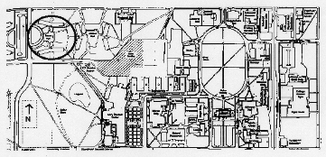
The site chosen for the Colorado State University Performing Arts Center is the plot of land upon which Green Hall now stands (Figure 1). This area was chosen primarily for its location on the CSU campus and its proximity to the downtown area. Green Hall is a condemned building and is not currently used for anything beyond university storage. Some office space has been granted to the branch of the CSUPD dealing with parking violations, but this department could easily move back to its old location at Aylesworth Hall. Our firm believes that this space would be better used as a home for the performing arts than as the site of a crumbling warehouse.
We have considered possible disturbances that the construction of the performing arts center on this plot might cause. Due to the close proximity of Green Hall to Allison Hall and Parmelee Hall, we have decided to begin construction early in the summer, after classes have ended. Green Hall will be torn down first, and construction of the performing arts center will begin immediately. This will allow us a good start on the project while students are not living in the nearby residence halls. According to the front desk at Braiden Hall,, which is located near the Morgan Library construction site, residents do not have a problem with noise and there have been no complaints of disturbances. MASK Engineering believes that this will be the case for the residents in Allison and Parmelee when they return in the fall as the performing arts center is finished.
Figure 2.1
Cable-stayed Technology
A cable-stayed support system was chosen for the design of the CSU Performing Arts Center. One reason for choosing this system was to allow for a more compact facility because the space available on campus was limited. Another reason was to give patrons an unobstructed view of events by eliminating the need for columns.
The original use of cable-stayed technology was seen in bridges. German engineers established the design of cable-stayed bridges in the 1950's and 1960's. This technology was eventually adapted to buildings, using cables to support the roof. Each tower is buttressed by two sets of cables, transferring the load into the ground. Without a roof load to support, columns are not needed in the complex and the space can be used in more ways.
The concept behind cable-stayed technology is to have the supporting reactions to the load directed in only vertical directions as opposed to vertical and horizontal. It also eliminates any tension and/or compression force (Figures 3.1 and 3.2) . For a building, the load of the roof is directed through the cables, to the towers, and down to the ground. The walls do not support the roof as they normally would; only the cables are used to hold up the roof. An example of a cable-stayed building is the Alamodome, a multipurpose stadium in San Antonio, Texas (Figure 3.3). Our model is based on this design.
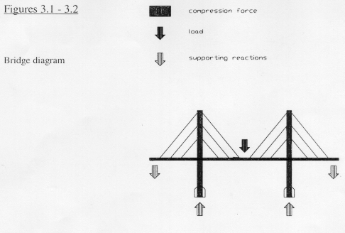
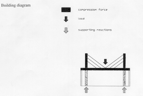
Figures 3.1-3.2
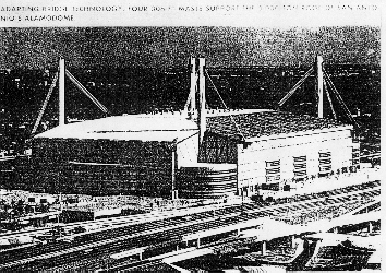
Figure 3.3
Main Hall Acoustics
Background
One of the key characteristics of a concert hall that greatly influences sound quality, is its reverberation time (the time before the decay of the reflected sound ). For orchestral or band music, the ideal reverberation time is approximately two seconds. Any times approaching 1.6 seconds will lead toward a dry, dead sound ( Beranek 1962 ). The other extreme is a time that is too long. This causes the music to lose its clarity, an excessive loudness, and the blending of incompatible chords ( Beranek 1962 ). A hall's reverberation time can be affected by such things as the volume of the room or the number of people in the audience. In the construction of the main hall for the CSU Performing Arts Center a balance will be determined that will create a reverberation time of two seconds, as independent of audience size as possible.
Sound quality is also greatly determined by the warmth of the sound. Warmth is determined by the fullness of the bass tones. If the middle frequencies of a sound have longer reverberation times than the low tones, then the sound will become brittle (Beranek 1962 1).
Materials
Table 4.1 gives the absorption coefficients of different frequencies for common surfaces. It shows that materials such as heavy curtains or thick carpet absorb are the ideal choice for decreasing the intensity of higher frequencies. This leads to the production of a more full, warm sound. Retractable banners will be built into the ceiling, and can be lowered to create this effect. Cloth seats will be used as they best assimilate an occupied audience area ( Beranek 1962 ). This allows sound within the hall to be independent of audience size. The low sound absorbance of plaster also makes it ideal for the creation of the desired reverberation time of two seconds.
Design considerations
The intensity of the direct sound should not be too weak, but at the same time, it must not become uncomfortably loud. This problem will be dealt with by limiting the length of the room, and by designing the surfaces above and around the stage to project the sound evenly throughout the concert hall. Another problem arises with the seats placed under a balcony. To prevent a muddiness within the sound, the depth under the balcony should not exceed the height of the opening beneath the balcony, as shown in figure 4.1 ( Beranek 1962 ).
Table 4.1
Absorption coefficients of different frequencies for main hall surfaces
| Frequency ( Hz ) | ||||||
| Surface | 125 | 250 | 500 | 1000 | 2000 | 4000 |
| heavy fabric | 0.14 | 0.36 | 0.57 | 0.72 | 0.70 | 0.62 |
| heavy carpet on concrete | 0.02 | 0.06 | 0.16 | 0.37 | 0.59 | 0.64 |
| cloth seats | 0.44 | 0.60 | 0.76 | 0.87 | 0.80 | 0.70 |
| plaster on brick | 0.01 | 0.01 | 0.01 | 0.02 | 0.04 | 0.06 |
Table based on: Beranek, L. 1966. Music, Acoustics, & Architecture. John Wiley and Sons, Inc., New York.
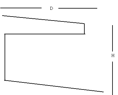
Figure 4.1
Balcony design
Figure based on: Beranek, L. 1966. Music, Acoustics, & Architecture. John Wiley and Sons, Inc., New York.
Floor Plans
The Colorado State University Performing Arts Center consists of three levels. The total area of the complex is 56,500 square feet. The basement and ground floors consist of 20,500 square feet apiece. The second floor has a square footage of 15,500.
The basement level of this center (Figure 5.1 ) includes two main dressing rooms with shower facilities as well as four private dressing rooms with individual restrooms for guest performers. The mechanical room for the building will be in the basement, housing such devices as the heating, ventilating, and air conditioning equipment as well as the mechanics for the elevator. A spacious performers' lounge has also been added in to the basement to provide a relaxing environment for the center's performers.
The building's main floor (Figure 5.2 ) includes the main performance hall as well as a small rehearsal hall. The main hall is 5,000 square feet and has a seating capacity of 1,200. A coffee shop and art lounge have been included in this plan for the enjoyment and convenience of the patrons. A large classroom is provided for dance classes as well as rehearsals. Sufficient office space is included adjacent to the center's box office.
The top floor of the CSU Performing Arts Center (Figure 5.3 ) includes a walk- around balcony overlooking the main lobby as well as a balcony for the main performance hall. An elevator is provided for travel between the first and second floors. A recording studio is also located on this floor as an added bonus.
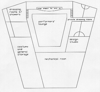
Figure 5.1
Basement level floor plan
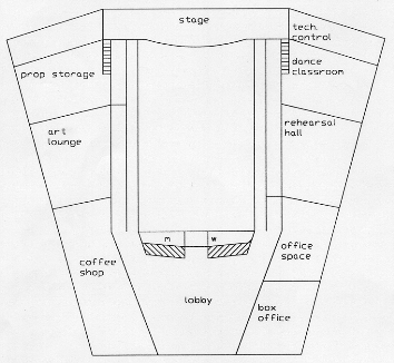
Figure 5.2 Ground Level
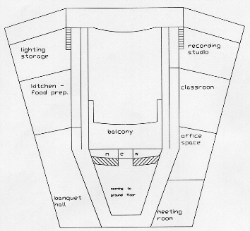
Figure 5.3 Second level floor plan
Conclusion
In conclusion, MASK Engineering has carefully planned out the details of the proposed CSU Performing Arts Center. This facility will be a benefit to the performing arts programs at CSU, the students and faculty of CSU, as well as the members of the community. It will allow for the improvement of programs in the area and growth of interest in cultural events. The site of Green Hall will be accessible to both students and the community, and will use the space on campus most efficiently, preserving the green areas. A cable-stayed support system for the roof will allow for a compact facility and an unobstructed view for patrons. In order to achieve the best acoustical results in the main performance hall, we have designed a rectangular hall made of plaster. We have also designed the hall so that the depth under the balcony does not exceed the height of the opening beneath the balcony. The total area of the complex will be 56,500 square feet split into three levels. The main hall will have a seating capacity of 1,200. The facility contains necessary rooms to accommodate the performers, and several rooms to make the visit of the patrons more enjoyable.
Instructor Comments
Introducton:The one thing lacking in this introduction is a good, brief description of their design. The discussion about the benefits, etc. are not clear to me without first hearing what their solution is.
They do a good job of discussing the motivation for their project.
I personally like the introduction to end with a brief description of what the remaining portions of the report contain.
A little more background and possibly a map would help this discussion. DO NOT assume your reader is as familiar with this as you are.
Figure 2.1: With this figure, I'm not certain whether or not this is the caption or part of the title of the figure. This says, "Map of Campus, circle area represents the site where Green Hall currently stands." That mixes what it is. A revised caption would read something like "Map of CSU Campus Indicating Proposed Site Location."
The map also borders on plagiarism. When you take a figure from someone else's work, you put in the caption "from" and you list the document and that document better be in the references. And it's not "based on," it's "from." And that's a subtlety you need to learn. There's a distinction between something that is "from." To get permission to use this map, the writers would have to get copyright approval from the source. If they based it on, if they've redrawn the figure and they've used this map as a source, then they should, even at that point say, "based on," or "the CSU Map is from such and such source, page such and such, dated such and such." It needs to be a complete reference.
Another problem is that by looking at this map, I can't read a darn thing from it. I know that's the Oval. And I know the Weber building because I live in it. But the scale is so off, and the reproduction is so bad that they should have made the decision to either find a better original or not used it at all.
They should also include an arrow to Green Hall. The circle's not quite sufficient. The Oval isn't that different from the circle. Part of the problem is that the scale is wrong. I shouldn't have to look at a figure and guess what writers want me to see. It should be blatant.
In terms of the placement of this figure, I have several thoughts. The writers put their figures on separate pages within the body of the text. That's an acceptable style. I have no problem with that. It comes after its first reference in the text, which is important. The inappropriate thing is referring to it in the text as "figure 1," and referring it on the paper as figure "2.1."
Figures 3.1 and 3.2: These figures are labeled "Figures 3.1 and 3.2." Which one's which? They should not be put together. What I mean by this is they can be on the same page, but Figure 3.1 needs to be where Figure 3.1 is and Figure 3.2 need to be where Figure 3.2 is. The figure numbers should not both be up at the top. The reader shouldn't have to guess "is there a dividing line between the figures or does it divide some where else?" If they had captions associated with those figures' numbers, that would not have occurred. I actually like figure numbers underneath the figure, not above the figure.
With these figures I again wonder if they were taken from some source not referenced. And so, I'm not sure these are originally hand drawn by the students. Now if they are, they could have done a better job because the legends don't fully tell me what it means. The dark square means compressive force, and I don't know what that means. I understand "load" and I understand "supporting reactions," but I don't understand "Building diagram?" That's a building?
I'm not convinced these were meant to be two figures. I think they should be one. They're talking "cable stay" technology which would of been nice to have in the title. I think they're trying to draw an analogy between "here's how a bridge is done, and here's how it's also now being done in buildings." But it's not coming through.
This figure is placed at the right location. The key thing with placement in text is to put the figure as close as possible after it is first referenced. Never put it before you reference it and don't bury it deeply in the text. This is one of the clues that leads you decide whether you do an appendix or not. If you find you're having so many figures that when you try to put them in text they're turning out to be five pages straight of figures, that's a clue that you have so many figures, they're probably better handled in the back.
Figure 3.3: I know the writers didn't take this photograph! And I want to know who did take the photograph because that person needs to be credited. This figure's location in the text is fine. I'm happy with their style of one figure per page.
The quality of this reproduction is not very good. But that's always hard with photographs. It does make their point, which is the tall columns with the cables coming off. However, the fine details have been wiped away, so it's a bad photograph for their purposes.
This visual also works off the previous two visuals since it represents another way of looking at the particular structure. Whenever you can, especially when you're dealing with new technology, you've got to give people good visual images. And anyway you can do that is useful. Schematics allow you to do certain things like add arrows and show load paths. So this had a different function. The other two depicted load paths. This one was trying to give the viewer a big picture of what this looks like. After all, a bridge is difficult to imagine.
Table 4.1: This table accurately sites its source, "Table based on such and such." However, it gives too much information. All that is needed is the author's name, so readers could then look it up in the references.
Some suggestions are to put "Based on Byronic L 1966." all within the caption. Then the table would physically separate the title if I felt there was a title too, separate from the caption. It would then be clear, spatially, that there's a caption up here. And below is the title on the table.
Another alternative would be to "footnote" the table. Not a real footnote, but a footnote within the table. This can be done by using an identifier like a "star." So I might say, "Table," if it's the whole table, and put, "Table 4.1*" showing that there's a clue to come, down at the bottom. If there were particular pieces of information in here, a particular column or something, such as just the surface frequency or heavy fabric, or it was two of these, I could then put stars on there and indicate, "This was based on this person's work, as opposed to my original work.
Figure 4.1: When a figure like this needs to be drawn, you should follow normal conventions for drafting, including dimension lines with arrowheads. I'm assuming the "D" and "H" represent "depth" and "height."
A figure is for clarification, and this one raises many questions. I don't know what the point of this figure is. I'm assuming there's a value here. If this was to be a conceptual diagram representing, "We now can do a sensitivity D over H," then you might do that. But I think they were trying to show us how big is was. It's not a very good figure because it leaves too much to my imagination. This is not worth a thousand words.
Figure 5.1: A scale should be included here. Also, these should be numbered. Students should indicate how each one works (e.g. doors, etc.).
Figure 5.2: A scale should be included here. Also, is that the Performance Hall in the middle?
Figures 5.1, 5.2, & 5.3: These were done with AutoCAD, so it's hard to criticize the quality of them because this is what AutoCAD produces.
"M" and "W" should be explained; I am assuming these stand for a Mens' Room and a Women's Room. There are better visual ways of doing that more explicitly, as with international symbols, etc. Also, "E" for "exit" is a little short.
These are meant to be schematic floor plans. And they are. It'd be nice to have a "north arrow" here. Students will always think of a "north arrow" on a map, but they won't necessarily think of it on a building. It's important because it helps readers tie back to the orientation of the building on the site.
These serve very well as schematics. They do not serve well as details. They don't show doors; they don't show windows. But this design is more at the conceptual level, so I understand why they did it. The detail fits the purpose. The problem is, when readers look at this example, they don't necessarily know that whole context.
It really would have been nice to have put these visuals in the front. A neat way to have done that would have used this as a figure on the title page to introduce the concept right up front.
The captions on these are all right. If you put to much lettering on a figure, it gets busy. This is actually a pretty good balance. They're descriptive enough. I understand just about what everything is. I'm not sure what the basketball-like part is since it's not labeled. But overall, these are pretty good, typical, schematic drawings.
Using a different font is a stylistic mistake. If you have an area that you want to label and the font you're using doesn't fit in there, don't just use a real small font because it fits. Move the label out and put an arrow to it.
References
Baranek, L. Music, Acoustics, & Architecture. New York: John Wiley and Sons Inc.,

	1966.

Kosman, Josh. "The Rest of the Best." Civil Engineering, July 1994, 44-48.


Newhouse, Elizabeth L., ed. The Builders: Marvels of Engineering. Washington D.C.:

	The Book Division, National Geographic Society, 1992, 50, 74-5.
Instructor Comments
This is a fairly low number of references. Three is minor. Sometimes, you might not have references because much of your text is original work on your part, but then you should include appendices on calculations and such.
Appendices: When deciding to place information in an appendix, ask yourself, "Are there reams and reams of figures that are best put in an appendix or will using a small number of figures integrate better throughout the text?" and "Do I have a source document that’s very critical to the report I want to attach to it, a data report or letter that is secondary to the actual writing, but not secondary to the major issue of the report?" Much of this depends upon your interpretation. A likely source for appendices is computational results. I like to think you’re doing work, so it’s logical to do screen dumps or spreadsheet dumps of tables and calculations. The best place for these is in appendices.
Perspectives on Technical Reports
Dave Alciatore, Mechanical Engineering
Writing Technical Design Reports as a Group
"Often, technical design reports require that multiple experts help write them. This is called "concurrent engineering." This way, everyone involved with a project contributes. More ground gets covered this way. The report is also a good way to document a design. Then, if problems arise later, everyone can refer to the document. This helps determine where changes were made, etc."
Report Content
"Every company has different means of documentation. Typically, in industry, you won't have to provide as much history in a technical report. This is because in academia, we want you to document your thought processes and project evolution. In industry, you will concentrate more on the initial problem, requirements, and solutions. "
Neil Grigg, Civil Engineering
Multiple Reports for a Project
"Suppose your engineering task is to build a retaining wall. As the main engineer, you've got to consider many aspects: the load, the height, the structural design. You'll write a report where you state the goals and how they will be accomplished. This includes input parameters, the conditions in which you have to work, alternatives, recommendations. Next, soil engineers may actually test the soils at the location. They would then produce a report about what they found. Every project generates multiple reports. "
Report Content
"Many designs begin with identifying the problem, determining the goals, and creating a list of alternatives. The next part is the evaluation. This includes the technical, legal, economic, financial, environmental, and social evaluations. Then you make recommendations based on these evaluations. Most reports, especially design reports include this information. "
Tom Siller, Civil Engineering
An Example Technical Report
"I once helped produce a report about rock fracturing for a whip site. In that report, we stated the situation, how we would analyze the situation, (because we wanted to be hired as the engineers for the project), the analytical tools we would develop, and our results based on those analytical tools. We did not present a shaft design. Overall, the report presented our way of understanding the issues that would help design a shaft."
Your Report's Purpose
"If your report's purpose is to create an artifact, then you have to present all the technical aspects of the design. This way, someone can read the report and build your artifact. You have to be aware of very fine details whenever you write a report. For instance, will your designs receive public approval? Are you in compliance with regulatory agencies? And so why you are writing the report helps you determine what details to include and exclude."
Kowalski, Dawn. (1994). Engineering Technical Reports. Writing@CSU. Colorado State University. https://writing.colostate.edu/guides/guide.cfm?guideid=88